

One-Page Resume: What to Include, When to Use It, and Examples
A one-page resume should be a clear, text-first document for applications, not your entire professional identity. Learn what belongs on the page and what works better on a visual website.

Javier Martínez Samblas
Founder of Self · AI-powered resume-to-website platform
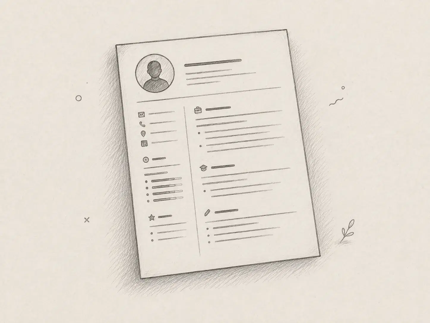
Most resume formats are relics of a paper-first hiring process. They encourage candidates to spend hours adjusting columns, icons, colors, and tiny margins even though an applicant tracking system mainly needs readable text and a recruiter initially needs a quick account of relevant experience. A one-page resume works best when it accepts that limited job instead of trying to contain an entire career.
That does not make the resume unimportant. Many employers still require a file, and a clean PDF remains a practical way to move through a formal application. The mistake is treating that file as your complete professional presence when a visual website or portfolio can present your work, links, personality, and evidence far more effectively.
What a one-page resume is actually for
A one-page resume is a concise application document that helps a hiring team confirm your role, recent experience, core skills, education, and most relevant results. It is an index, not an archive, so every line should help someone decide whether to continue the conversation. The page does not need to explain every project, reproduce your full job history, or carry the visual identity of a personal website.
This narrower purpose is useful because it makes decisions easier. You can choose a simple reading order, use standard section names, and remove decorative elements that add little information. Once the essentials are covered, richer material can live behind a professional link where it has enough room to be understood.
When one page is enough
One page is usually the right constraint when your candidacy can be understood through a focused selection of recent work. The strongest candidates are not necessarily the ones who provide the most history; they are the ones who make the relevant pattern obvious. A short document also reduces the temptation to preserve old responsibilities that no longer support the role you want.
- Students and recent graduates can prioritize education, internships, substantial coursework, and two or three credible projects without padding the document.
- Early and mid-career professionals can focus on recent roles, measurable results, and the skills that matter for a specific position.
- Career changers can foreground transferable achievements and relevant projects instead of documenting every responsibility from the previous field.
- Freelancers and consultants can summarize their positioning and selected client outcomes, then direct readers to a portfolio for the full work.
A second page is reasonable when the detail is genuinely part of the evaluation. Senior leaders, researchers, academics, clinicians, and people with extensive publications, certifications, or regulated experience may need more space. The answer is not to force everything into eight-point type; it is to keep the document readable and edit with a clear sense of relevance.
What to include on a one-page resume
A useful one-page resume has a visible hierarchy and very little ceremony. Start with the information required to identify and contact you, then spend most of the page on evidence that supports the target role. Generic objectives, rating bars, headshots, oversized logos, and long lists of soft skills rarely deserve space that could hold a result or a useful link.
- Your name, target role, location when relevant, email, phone number, LinkedIn profile, and a short link to your professional website.
- A compact profile of two or three lines only when it clarifies your specialty, level, industry, or the value you bring to the role.
- Recent experience with job title, employer, dates, and a small number of bullets that show ownership, scope, and measurable outcomes.
- Selected projects when they provide stronger evidence than another routine responsibility, especially for technical, creative, and early-career candidates.
- Skills grouped in plain language, with priority given to tools and capabilities that appear in the target role rather than an exhaustive keyword inventory.
- Education, licenses, and certifications in proportion to their importance, without using half the page for details that no longer influence the decision.
A practical one-page resume structure
There is no universal percentage for each section, but the following structure is a reliable starting point. It keeps the document easy to parse while reserving the largest area for professional evidence. The exact balance should change with experience, because a graduate and a sales director should not give the same amount of space to education.
Header
What belongs there
Identity and contact routes
Example
Name, role, email, LinkedIn, personal website
Profile
What belongs there
A focused positioning statement
Example
Product designer focused on accessible B2B workflows
Experience
What belongs there
Recent roles and strongest outcomes
Example
Reduced onboarding time by 28% across three product teams
Projects
What belongs there
Selected proof relevant to the role
Example
Built and launched an internal forecasting tool used weekly
Skills and education
What belongs there
Useful qualifications in compact form
Example
TypeScript, React, accessibility; BSc Computer Science
| Section | What belongs there | Example |
|---|---|---|
| Header | Identity and contact routes | Name, role, email, LinkedIn, personal website |
| Profile | A focused positioning statement | Product designer focused on accessible B2B workflows |
| Experience | Recent roles and strongest outcomes | Reduced onboarding time by 28% across three product teams |
| Projects | Selected proof relevant to the role | Built and launched an internal forecasting tool used weekly |
| Skills and education | Useful qualifications in compact form | TypeScript, React, accessibility; BSc Computer Science |
Notice that the example does not use a sidebar full of icons or skill percentages. Standard headings and ordinary text are easier for software to extract and faster for a person to scan. Good typography and spacing still matter, but they should improve reading rather than turn the application into a graphic-design exercise.
Three examples of what to prioritize
The same one-page constraint produces different documents for different careers. The point is not to copy a fixed template, but to decide which evidence earns space for the next opportunity. These examples show how that choice changes without making the layout more complicated.
- A software engineer can lead with recent engineering roles, two production outcomes, and one selected project, while moving architecture diagrams, repositories, and technical explanations to a website.
- A marketing lead can emphasize campaign impact, budget or team scope, and a few commercial metrics, then use an online portfolio for creative work, talks, reports, and campaign context.
- A career changer can reduce older job descriptions, translate transferable achievements into the language of the new field, and link to recent coursework or projects that prove the change is already underway.
Why most visual resume templates are a bad compromise
Many modern resume templates try to make a PDF behave like a website. They add multiple columns, decorative timelines, logos, photographs, progress bars, and dense color blocks, but the result is often less useful in both formats. Extraction software can misread the order, while recruiters still cannot open a project, watch a demo, explore a case study, or understand the decisions behind the work.
A plain document is not a sign that you lack personality. It is a deliberate choice to give the application system a file it can process reliably. Your visual identity belongs in a medium that supports it properly, with responsive layout, links, media, navigation, and enough space for evidence.
What an ATS needs from the file
For most ordinary applications, a single-column, text-first resume with familiar headings is enough. Use selectable text, conventional date formats, clear job titles, and keywords that honestly match your experience and the vacancy. Exporting that document as a straightforward PDF is generally practical when the employer accepts PDF files, although you should always follow the application instructions when a system requests DOCX or another format.
An ATS-friendly resume does not need to be ugly, but it should avoid cleverness that interferes with reading order. Do not hide essential experience in graphics, rely on icons without labels, or shrink the type to preserve an arbitrary page count. The system needs a dependable version of your facts, not a miniature portfolio trapped inside a document.
What recruiters want after the initial screen
Once a candidate passes the first screen, the questions become more human. Recruiters and hiring managers want to see whether the work is credible, how the person communicates, what they actually contributed, and whether their experience forms a coherent story. A visual website or portfolio is better suited to that review because projects, writing, media, recommendations, and professional links can be opened instead of merely mentioned.
Many recruiters prefer that richer experience when they are comparing promising candidates, particularly in creative, technical, marketing, research, consulting, and project-based roles. It is easier to remember a clear profile with visible proof than another attachment with a slightly different template. The website does not replace the required resume; it gives the resume somewhere useful to lead.
Use the PDF for submission and Self for persuasion
The most practical setup is a restrained one-page PDF for application systems and a Self page for the fuller professional story. Self can turn the career material you already have into a responsive website with structured experience, projects, links, and a design that works as an actual web page. You can review resume website examples for different careers or follow the focused workflow to turn your resume into a website without rebuilding your history from scratch.
Put the Self link in the contact area of the PDF, LinkedIn profile, email signature, and application fields that accept a portfolio or personal website. The document then performs the administrative job it is good at, while the website provides the stronger first impression and the evidence that helps someone remember you. Updating the site also avoids sending a new attachment every time a project, publication, or result changes.
A simple workflow that stays current
- Create a clean master resume, then edit it down to the experience and keywords that support each application rather than redesigning the document every time.
- Keep the exported PDF readable, selectable, and conventionally structured, and test the file by copying its text into a plain editor to check the reading order.
- Use Self for the material that deserves more room, including project context, work samples, links, visuals, publications, and a more distinctive professional introduction.
- Review both surfaces together so dates, titles, and core facts agree, while allowing the website to carry more detail and a much stronger visual presentation.
A one-page resume succeeds when it stops trying to be everything. Keep the PDF simple enough for software and quick screening, make every line relevant, and let a professional website do the work that static documents have never handled well. That combination respects the hiring process without allowing an outdated format to define the way your career is seen.